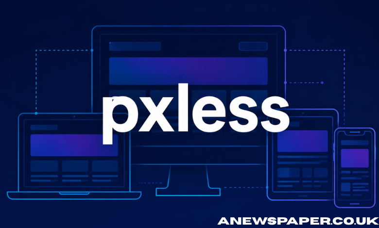
Digital design has long depended on pixels as the basic unit for building interfaces. Every button, text block, image, and layout has traditionally been defined in fixed pixel values. This approach worked when screens were more predictable and device variety was limited. That situation has changed completely. Pxless is a modern design approach that moves away from fixed pixel thinking and focuses on flexible, adaptive, and scalable interfaces. Instead of designing for exact measurements, pxless encourages systems that respond naturally to screen size, resolution, and user context.
It is not a tool or a framework in itself. It is a way of thinking about how digital interfaces should behave in a world where no two screens are the same.
What Pxless Means in Practical Terms
At its core, pxless means reducing reliance on fixed pixel values in design and development. Instead of defining elements with rigid numbers like 200px or 16px, pxless systems use relative units, proportional scaling, and responsive rules.
For example:
- Font sizes adapt based on screen width or user settings
- Layout spacing adjusts according to available space
- Images scale without breaking alignment
- Components resize without losing structure
The idea is not to eliminate pixels completely but to stop treating them as the primary decision-making unit.
In pxless thinking, the interface is not locked into a fixed grid. It behaves more like a fluid system that reorganizes itself based on context.
Why Traditional Pixel-Based Design Became Limited
Pixel-based design was effective in earlier stages of the web. Designers could assume relatively consistent screen sizes, especially when desktop browsing was dominant. A layout set at 960px width or a font defined at 14px would appear mostly consistent across users.
However, this consistency no longer exists.
Modern digital environments include:
- Smartphones with different screen densities
- Tablets with variable aspect ratios
- Laptops with scaling settings
- Large monitors and ultrawide displays
- Smart TVs and embedded screens
A fixed pixel layout cannot reliably adapt to all of these environments. The same design may appear too small on one screen and too large on another.
This is where problems begin:
- Text becomes hard to read on high-density displays
- Layouts break when content overflows fixed containers
- Users zoom in or out manually to compensate
- Designers must create multiple versions of the same interface
Pxless addresses these limitations by removing dependency on rigid measurement systems.
The Core Principles Behind Pxless Design
Pxless is built on a few key principles that guide how interfaces should be designed and developed.
1. Flexibility Over Fixed Structure
Instead of locking elements into fixed sizes, pxless design allows components to stretch, shrink, and reposition based on available space.
2. Relative Measurement Systems
Units such as percentages, em, rem, and viewport-based sizing replace strict pixel values. This creates proportional scaling rather than fixed dimensions.
3. Content-First Layouts
The content determines the layout instead of the layout forcing content into a predefined structure. This reduces distortion and improves readability.
4. Device Independence
Interfaces are not designed for a single device type. They are created to function across a wide range of screen environments without separate redesigns.
5. Adaptive Typography
Text adjusts dynamically to improve readability across screen sizes without manual intervention.
These principles together form the foundation of pxless thinking.
The Technical Shift Behind Pxless Systems
From a technical perspective, pxless design is supported by modern CSS capabilities and responsive design techniques. While the concept is broader than code, implementation relies heavily on flexible styling systems.
Common techniques include:
- CSS Flexbox and Grid for fluid layouts
- Relative units like rem and em for scalable typography
- Viewport-based units such as vw and vh
- Media queries for contextual adjustments
- Container-based responsiveness for component-level adaptation
These tools allow developers to reduce dependency on fixed pixel values and build interfaces that respond dynamically.
However, pxless is not just about using these tools. It is about how they are applied together as part of a consistent design philosophy.
How Pxless Improves User Experience
User experience is one of the main areas where pxless has a noticeable impact.
Better readability
Text that scales appropriately across devices reduces strain and improves comprehension.
Consistent interaction
Buttons, menus, and touch targets remain usable across different screen sizes without manual adjustments.
Reduced friction
Users no longer need to zoom or scroll excessively to interact with content.
Improved accessibility
Adaptive sizing supports users with visual impairments or different device preferences.
More natural layouts
Interfaces feel more aligned with the device they are viewed on, rather than forced into a rigid structure.
These improvements directly affect how users engage with digital products.
Performance and SEO Benefits
Pxless design also influences performance and search engine optimization in indirect but important ways.
When layouts are flexible and optimized:
- Pages render more efficiently across devices
- Fewer layout shifts occur during loading
- Mobile usability improves significantly
- Bounce rates tend to decrease
- Search engines interpret the site as more mobile-friendly
Since mobile-first indexing has become a standard approach for major search engines, adaptive design systems contribute to better visibility in search results.
Pxless supports this by ensuring that content is consistently accessible and readable across all platforms.
The Role of Mobile Usage in Driving Pxless Adoption
Mobile traffic has become the dominant source of web usage in many regions. With more than half of global traffic coming from mobile devices, design strategies must prioritize small screens first. Pixel-based layouts struggle in this environment because they often assume fixed widths and predictable scaling. Mobile devices, however, vary widely in resolution, aspect ratio, and performance capabilities. Pxless design addresses this by removing assumptions about screen size. Instead of designing for a specific resolution, interfaces are built to adapt automatically. This shift is one of the main reasons pxless thinking is gaining relevance in modern development practices.
Challenges in Moving Toward Pxless Design
Despite its benefits, adopting pxless systems is not without challenges.
1. Legacy systems
Many existing websites and applications are built on fixed pixel structures, making transition complex.
2. Learning curve
Designers and developers must rethink how layouts are constructed, especially if they are used to pixel-based precision.
3. Inconsistent implementation
Without clear standards, different teams may apply pxless principles in different ways, leading to inconsistent results.
4. Testing complexity
Responsive systems must be tested across more conditions, increasing development effort.
5. Design predictability
Some designers find it harder to predict exact layout outcomes when using fluid systems.
These challenges do not prevent adoption, but they do slow down full transition in some environments.
Pxless in Modern Design Systems
Many modern design systems already incorporate pxless principles without explicitly labeling them that way.
Design frameworks increasingly rely on:
- Scalable spacing systems
- Component-based architecture
- Responsive typography rules
- Fluid grid structures
These systems prioritize adaptability over fixed measurements.
Design teams also build token-based systems where spacing, color, and typography are defined in scalable units rather than fixed pixels. This makes design more consistent across platforms.
Pxless thinking aligns closely with these modern approaches.
The Future of Pxless Thinking
As devices continue to evolve, the need for flexible design systems will increase. Emerging technologies such as foldable screens, AR devices, and wearable displays will further reduce the relevance of fixed layouts. Pxless thinking supports this future by focusing on adaptability rather than precision. Instead of designing for a single format, systems are built to respond to unknown or changing environments. This shift may also influence how design education and development training are structured in the future, with more emphasis on systems thinking rather than fixed measurements.
Conclusion
Pxless represents a fundamental shift in how digital interfaces are designed and developed. It moves away from rigid pixel-based systems and toward flexible, adaptive structures that respond to user context and device diversity. It is not a replacement for design precision but a redefinition of how precision is achieved. Instead of controlling every pixel, designers control behavior, relationships, and adaptability. As digital environments continue to expand across devices and screen types, pxless approaches offer a practical way to maintain usability, performance, and consistency without relying on outdated assumptions about screen design. The result is a more resilient and future-ready approach to building digital experiences.